After months of work with the help of Neil, a great designer, and my Excel-blogging friend Andrew, I’m happy to launch a brand-new design.
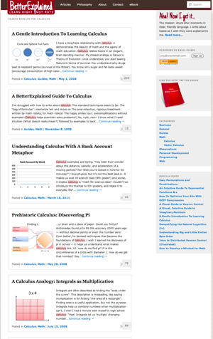
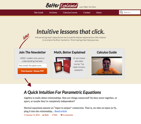
My goals were to be friendly, readable, and easy-to-navigate. Here’s a quick before-and-after:

New Logo
Neil did a fantastic job here — I’d been looking for a way to convey a welcoming, conversational tone.

New Homepage
A site about explanations should describe what it does simply, right?

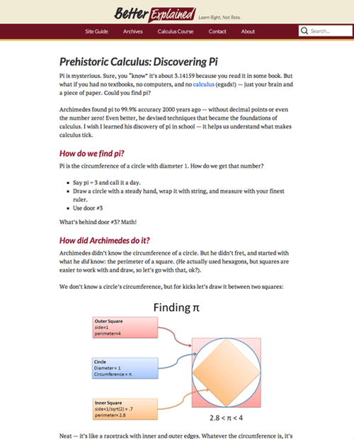
Better Readability
The fonts are bumped up, there’s more breathing room, and pages are optimized for iPads/iPhones. Instead of a text-dense cram session, I want an unhurried walkthrough of insights.

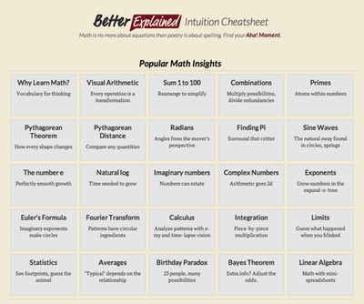
Intuition Cheatsheet
My favorite feature is a site summary that reduces insights to a few words. Previously, I had trouble navigating the various articles, and I bet you did too :). Readers of the newsletter got a sneak peek, and I have a PDF version I’ll be sending out to subscribers as well.

Overall, Better Explained is an excited friend who shares what really helps ideas click, not an authority trying to be the grand poombah of math. Let’s have a good time on this journey of learning.
Hope you enjoy the new site, feedback is welcome!
-Kalid