I hate to break it to you, but all graphs are not created equal. I realized this recently, wrote an article, and had my computer crash. The article vanished, but I’m determined to get this idea on the web. It’s a simple but interesting concept.
Types of Graphs
Let’s start with the types of graphs. Just as the universe can be divided into “bananas” and “non-bananas”, I’m going to divide graphs into “map” and “non-map” graphs.
“Map graphs” are ones where the x and y axes correspond to distance: feet, meters, whatever you want. Thus, an x-y coordinate represents a location of some sort.
“Non-map graphs”, or all other graphs, are simply graphs where the coordinates do not imply distance, and instead the axes indicate production, time or some other variable. Some non-map graphs are hybrid graphs where one axis is distance and the other is not.
We’ll see that these graphs types are not the same and it’s important to know the difference.
Graph Examples
Consider this typical example of a map graph:
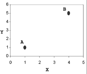
Suppose we want to get from the proverbial point A (1, 1) to point B (4, 5). Let’s say there’s some cost associated with the trip: time spent, gas used, or any other expense you want. Our goal is to minimize this expense by driving as little as possible.
We know the shortest distance between two points is a straight line. Using Pythagoras’ theorem, we figure out this distance is 5 units (making a 3-4-5 right triangle).
If we decided to drive along in a triangle, going straight across to (4,1) and then from (4,1) to B, it would be a distance of 7 units. Obviously, going from A to B directly is the least expensive path.
Now consider this typical “non-map” graph showing the number of cars and trucks at a rental company:
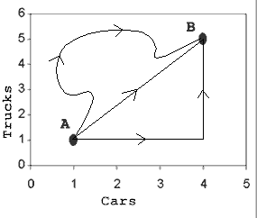
Suppose the company wants to increase its inventory. Currently it is at point A, with one car and one truck. It wants to get to point B (4 cars, 5 trucks). The cost of the “trip” is simply the cost of buying the new cars and trucks. How should it buy its vehicles?
This isn’t a very hard problem. We can see that no matter what “path” they take to B, the cost is the same — they end up buying 3 cars and 4 trucks. They can buy all their cars then all their trucks, vice-versa, or anything in between. They can even buy more cars and trucks than they need and sell them (assuming they can get the same price), which gives us the windy path. If they buy all of one type and then the other, they get a path shaped as a triangle.
Now, why are these two examples different? The simple reason is that distance does not matter in non-map graphs. Quite simply, if a map doesn’t have distance on its axes, then “distance” in the graph does not matter at all. Pythagoras’ theorem does not help us. Knowing that the shortest distance between two points is a line does not help us. We can’t escape the fact that we must end up with 4 cars and 5 trucks. But is this the end of the story?
Nope, it’s not the end of the story
It appears that in map graphs we want to take a direct route. In non-map graphs, we are stuck and can’t take a shortcut. Now consider this map graph, which shows terrain like mountains:
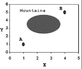
We still want to get from A to B, but now we must cross the mountains to do so. Suppose that in the mountains, the cost of traveling is 10 times normal. Suddenly the direct route doesn’t make as much sense. Taking the triangle route along the sides (from A to (4,1) to B) will be cheaper.
The lesson: On distance graphs where the cost varies from point to point, the cheapest path may no longer be a straight line. This enters the realm of math and physics problems, where you are measuring distance, but there is another effect (like a field) that changes the cost from point to point. Future articles will talk about this more.
Advanced example: Light waves
A great example of a hybrid graph (distance on one axis but not the other) is how light waves are usually portrayed. Here’s an example of a wave from Wikipedia:
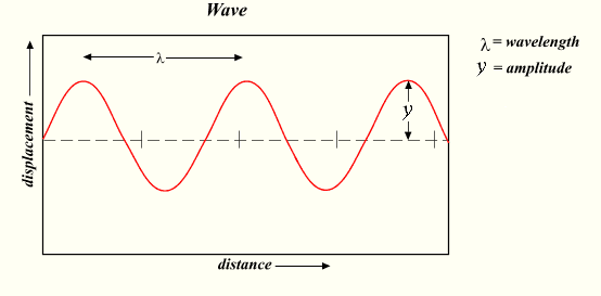
It’s a great image, but has the potential for confusion. Light waves don’t travel up and down like a rollercoaster, but it’s very easy to think that after looking at the graph.
In fact, what the graph is saying is that as the wave moves along, its displacement (strength) varies (the amplitude is the maximum value of the displacement). The light itself can take the same path. To show this, I added a line to the graph where the brightness (displacement) varies:
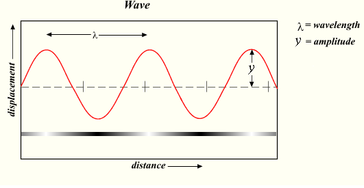
Notice how the brightness of the bar corresponds to the displacement of the wave. At the peaks it is white (full brightness = max strength in positive direction), and in the valleys it is black (full darkness = max strength in negative direction). In the middle, at the zero points, the displacement is “neutral” and has no strength (by the way, our distinctions of what’s “positive” and “negative” are arbitrary; we just have to pick a definition and stick to it).
That is the concept the graph is trying to convey, but it can be tough to get our brain to look at the graph and not think of a wave as wiggling up and down like a roller-coaster.
Sure, waves can wiggle up and down (just like most everything else in the universe), but that’s not the point of the diagram. The point is that the strength wiggles up and down, even for things moving in a straight line.
For you science geeks, yes, the true and mysterious nature of light appears to be an interesting particle-wave duality, where the strength of a particle varies with distance and shows other wave properties, but just hang with me for the sake of example.
Intuition
Distance matters on map-graphs. Although a straight line may be the shortest path, it’s not necessarily the “cheapest”. Be careful.
On other maps, distance on the graph doesn’t mean location. The axes don’t measure distance, so they paths along the graph don’t correspond to locations travelled. It’s easy to confuse objects taking winding paths on the graph as taking a winding path in the real world.