I’m no expert, but creating your own project invariably teaches you a few things about presenting your site. Here are a few lessons that helped me launch InstaCalc, a real-time, shareable calculator.
Get feedback, then release
Don’t push out your initial version to the public right away. Create a version, iterate, create it again, iterate, and create it again. Show your friends, family, coworkers, neighbors… and then show the world.
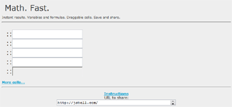
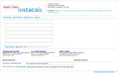
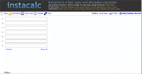
I’m not a designer, but the site has improved markedly over the course of various iterations. Take a look at the progression:
Of course, if you’re like me you can get caught in a constant trap of tweaking. It’s a learned skill, but have a sense of when it is “great” for a first-time visitor. It’s hard to look at your project with fresh eyes and imagine what a new visitor sees.
There’s a balance between refininement and “just get it done”, but it’s hard to impress first-time visitors without getting some feedback first. Don’t tell strangers about your site without first testing with your friends.
Show, don’t tell
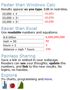
Site visitors may not read your text, but they can’t avoid a screenshot. Show how your product is useful. My top features were being fast, easy and shareable. I could just have written text about this, and tried to explain it. After getting feedback (see above), I used quick text (only a line or two) and screenshots to show the capabilities:

Is this the only way, the best way? No way. But I know it sends a clear, succinct message and is much more effective than a plain-text description. Don’t make people think about what your site does.
Speak in terms of the known
If you have a new idea, relate it to existing ideas. Rather than saying “This tool gets answers fast!”, which could be true but doesn’t tell us what it does, say: “Easier than Excel.”
This immediately:
- Gives a sense of the product: “Ok, it’s some sort of spreadsheet/calculation tool”
- Uses all the existing Excel marketing. Everyone knows what a spreadsheet is because Microsoft and others have spent decades educating and selling them to people. Use the existing lingo.
- Gives a concrete measure of comparison: Excel must be difficult to use in some way, let’s see how this stacks up.
Make it easy on the reviewers
The reviewers are the ones who help spread the word. The points above make it easy for them: give people screenshots, taglines, and feature comparisons so reviewers have something to talk about.
As you can see, multiplesitesused the text and screenshots as a starting point to discuss what was possible with their readers. Make your site reviewable. Have tours, FAQs, easy screenshots and quoteable taglines.
Put a name behind the site
A friend suggested I put up a quick about page and bio. This ended up being a big deal – there are lots of anonymous sites and services out there. Being able to say “InstaCalc was created by Kalid Azad, a recent entrepreneur…” in your review makes the article more substantial and adds credibility.
Make it easy to get feedback
I have three methods of feedback: an anonymous contact form, blog comments, and an email address. 95% of my feedback comes from the first two methods – most people can’t be bothered to send email directly, which is way more formal than a simple one-line comment in a blog or form.
Most people just want to fire off a quick note, so let them do it without a hassle. The contact form is fully anonymous – there are no required fields.
Don’t take my word for it
Like most things in life, experiment and see what works for you. Some products may be better served by secretive campaigns with less detail up front. Others might want anonymity (like the Mini-Microsoft blog). Take these lessons as nuggets of information gleaned from a single example, and use them if they make sense.


